Yumi Gaming
Converting Free Users to Paid Subscription Service
UI/UX Designer & Researcher
Tool
Methods
Client


The video game industry is constantly evolving and has made strides toward establishing more subscription based services. Even though many of these services are not yet household names, companies are looking to improve their offerings and services to entice players to change their way of looking at playing games.
I created Yumi Gaming, a video game community and store that focuses on creating a safe, supportive space for women in the video game industry. For this project, I'm assuming that the platform established itself two years ago and has been well received by users.

Yumi Gaming has built a healthy base of free users and now wants to evolve its features so they can monetize on a premium subscription. They want to design a paid experience with better features that entices users to upgrade.
According to the project brief, the main business goals of Yumi Gaming are to create an opportunity for new users to subscribe in the sign-up flow and for returning users to subscribe during sign-in or within the product. My project will delve into the video game subscription usage of my users and explore if the business goals are the best way to present the service to them.
Designed Yumi Premium, a flexible subscription service that offers unlimited access to the Yumi Gaming library. The subscription offers special perks to users such as discounts on game ownership, exclusive releases, and game bonuses. It also features the unique feature of being able to be paused and restarted at anytime, allowing the user full control depending on their gaming schedule.

To start off my research, I wanted to first take a look at other companies to get a better idea of what is already existing in the industry. A main insight I gathered from this analysis is that companies tend to focus first on offering the free plan and introduce the benefits of a premium subscription with multiple entry points throughout the app. Therefore, I advised that the project solution not include subscription mention in the sign-up/sign-in process of the experience since this creates a barrier to entry to the app.


To better understand the current video game subscription experiences of users, I conducted user interviews with individuals selected through a screener survey. I chose users who have used video game subscription services and ensured there was a mix of men and women, so that I could get different perspectives.
After reviewing the interviews, I pulled the most relevant user statements and used them to create a Google Sheets affinity map to help me organize the data. I coded the statements into categories and used those groupings to create overarching synthesis points. For each point, I analyzed the importance to the scope of the project and narrowed down my findings into three main insights.
Main Insights:


Now that I had my main insights, I decided to take a step back and analyze them in relation to the problem. Even though the user's community is important, for the scope of this project, I decided I would need to keep the focus on the insights more directly related to the subscription plan: the user's freedom of choice and value of plan. With these in mind, I formed a how might we statement that I used as the main focus for the project.
How might we offer value to the user so they feel justified in paying to subscribe.

Since I formulated for the main question for the project, I next started ideation with a brainwriting activity. I wrote down any ideas that came to mind based around the HMW question so I could start figuring out the direction of my design.
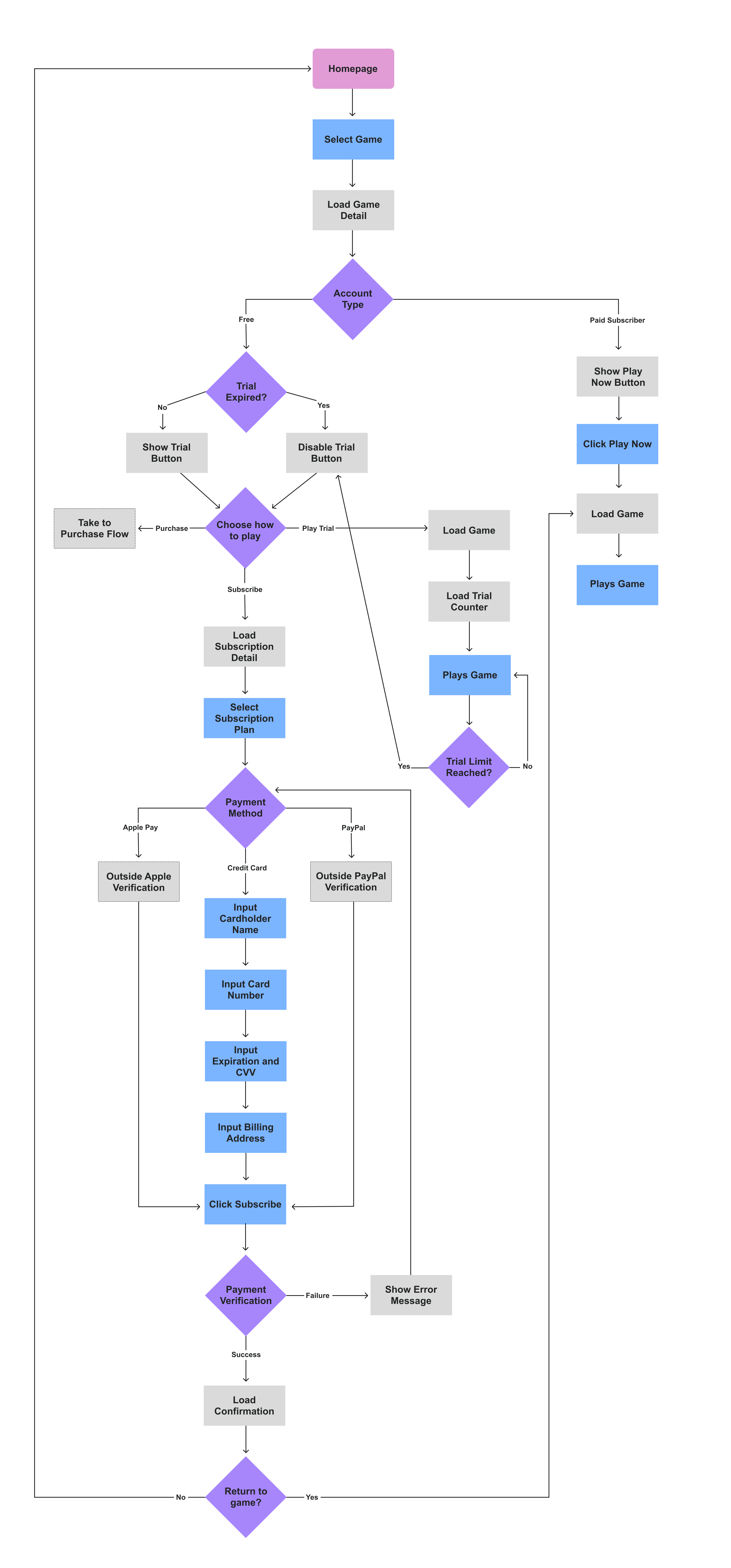
With these ideas starting to form the framework of the subscription plan, I further expanded upon my thinking by creating user flows to look at the path the user would take to complete a subscription purchase. After many iterations, I chose a user flow that would serve as the starting point for my wireframes.

After fleshing out my user flow, I started ideation on the layout of my main screens. I started with a few quick paper sketches, then moved to Figma to start building the wireframes. Within Figma, I was able to make adjustments and iterations until I settled on a design that I wanted to test.


Next, I used Figma to create a clickable prototype of my wireframes to test with users. I conducted remote usability sessions to test for the overall usability of the layouts and flows of the design. I also paid special attention to test for comprehension of the subscription plan to see if the design allowed for users to understand the offerings.


Yumi Gaming strives to be an inclusive community, focused on creating a welcoming and encouraging space for women in games.
The name Yumi is a Japanese and Korean word which means beauty and friend. The way it is pronounced is also a play on “You & Me,” furthering the idea of working together to create a beautiful community. Another interpretation of the word Yumi is “arrow” which is represented in the logo. It represents how Yumi wants to move the gaming industry forward and create a more welcoming community for all types of gamers.

After testing, I found that users were able to understand the flow of the design, but had difficulties when it came to comprehension of subscription offerings. For my high-fidelity changes, I focused on clarifying my free vs. paid offerings and simplifying the presentation of the plans.
Changes Made:


 High-Fidelity Testing Plan
Now with my new iteration in high-fidelity, I used Figma to create a clickable prototype to test in remote usability sessions. Overall, I discovered that the subscription plan comprehension completely improved in these test sessions. Users became aware of the premium plan as early as the homepage and showed a greater interest in joining. With this extra enthusiasm, I uncovered a new issue where users felt like they weren't being offered the option to subscribe fast enough after playing a trial. I was happy to focus my next iteration on this since this indicated that users were becoming aware of the service faster and were inclined to join.
Changes Made:


By the end of this project, I successfully created a high-fidelity prototype for Yumi Premium, a subscription service that gives users the flexibility to chose when to use it. Even though the business goals at the beginning were to create subscription points at the sign-up/sign-in, I found through my research that the design would better be focused on creating many touchpoints throughout the app, so as not to limit the users on entry.
To measure success, I would compare the conversion of free to paid users of my designs versus the sign-up/sign-in subscription point model. In this way, even though the method is different, if the conversion of users is higher with my design, the business will consider it to be successful.
Now, I decided to take a look back at my HMW question and see how I was able to answer it in the design.
How might we offer value to the user so they feel justified in paying to subscribe.
To answer the question, I was first able to establish a valuable free version of the app, with access to trial versions of games. With these trials, users became invested in playing and were more willing to subscribe to continue. To ensure that the user felt justified in paying for the premium plan, I included lots of benefits, such as game discounts, exclusive access, and in-game bonuses.
With the starting price of $1, there was such a low barrier to entry that users saw no problem in giving the premium service a try. I also wanted to make sure the user felt like they had the freedom in the experience by allowing them to cancel or pause the plan at anytime, allowing for flexibility to work around any gaming style.


Although this project is finished, I feel like there would be plenty of room to make improvements on the Yumi Gaming experience for the future. I would love to see the evolution of the platform and see how it would be beyond what the scope of this experience.
I truly had a wonderful experience working on this project as it was a subject that I am passionate about myself. It was fascinating to analyze the video game experience from a subscriber point of view as I feel like it is something that the industry is trying to move towards, but hasn't fully accepted yet. I look forward to watching how the video game industry will evolve and what new experiences will come in the future!