With the rise of remote workers, many need to find spaces in which they can get work done. PostUp was created as a solution to help remote workers quickly find coffee shops or public places to get work done.
I completed this project as a modified version of a Google Ventures Design Sprint within 5 days.
- Solution should be designed as a mobile app.
- PostUp doesn’t own physical spaces, they want to find existing places.
- PostUp wants to charge a monthly fee of $5.99/Month.

Problem
Remote workers have difficulty efficiently finding a suitable location to get their work done.
There are many resources out there to look at reviews on locations, but many of these are focused more on places to eat versus work. Workers are currently wasting time searching for a location and have to do extra work to find the information about the amenities they need.
Results
Designed PostUp, an app that provides users an efficient way to look at nearby locations with listings of amenities for their needs in a workspace.
Day 1: Understand & Map
I started the first day of the sprint by empathizing with my users. I wanted to get a better understanding of what kind of location characteristics would help determine a suitable workplace for them. I reviewed a design brief which included notes and a recording of user interviews.
Affinity Map
To better gather my thoughts, I created an affinity map of my interview notes. This helped me to gain insights into my user’s problems.

Insights and How Might We (HMW) Questions
After organizing my thoughts with the affinity map, I next created the main insights I would use to guide the focus of my project. I formed these insights into the questions that I wanted to look to answer through the design.
- Users have specific workspace needs:

How might we help users search for locations with the amenities and crowd levels that they need to work comfortably and efficiently?
- User cannot be interrupted:

How might we allow users to find a suitable environment based on space needed and time allowed so they will not be interrupted while working?
- User usually has limited time:

How might we efficiently assist users in looking for a nearby and appropriate location so that they don’t waste any time?
Map the Challenge
Now with these HMW questions in mind, I jumped into creating a map of a possible end-to-end experience for the user. This allowed me to quickly get my ideas down and understand the steps a user may take so I could figure out which area to focus on.

Day 2: Sketch
With a better idea of the problem, day 2 was devoted to getting inspired and starting to sketch a solution.
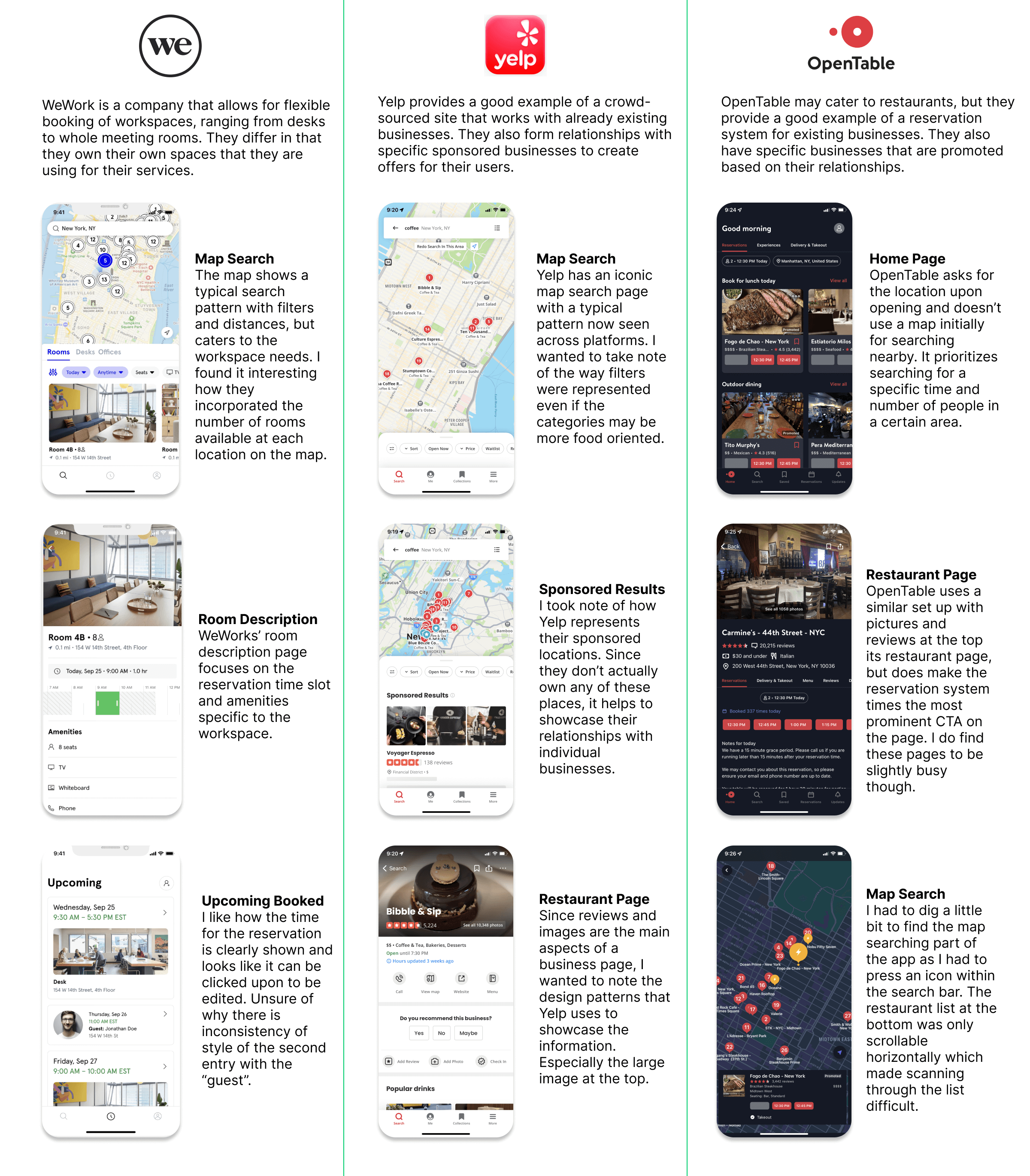
Lightning Demo
I started with conducting a lightning demo where I reviewed three competitors that solve a similar problem. I wanted to look at how they executed their solutions to better understand the space.
Crazy 8’s Sketch
With this inspiration in mind, I then decided to do a Crazy 8's sketch exercise to ideate for my most critical screen: location search results. This screen is the most important to my users since efficiently finding a location with the appropriate amenities and environment is their main goal.

Storyboard Sketch
After evaluating the ideas, I then created a small storyboard sketch, adding more details to the critical screen as the main focal point. I added the step before and after the screen to get an idea of how I want to develop my solution in the next day of the sprint.

Day 3: Decide
At the beginning of day 3, I reflected on my previous ideas and felt the project would benefit from a little more ideation to consider other possible designs before coming to a decision. Originally, since PostUp wanted to charge a monthly fee, I assumed the user would create an account upon opening the app and choose a plan from there. However, I decided that I did not want to limit the use of the app behind a sign-in process since that would hinder the initial user base. Instead, I decided to test out a premium service that would entice the users to subscribe with what it has to offer, but not require a sign-in at the beginning.
Further Inspiration
I had conducted the lightning demos of other location searching apps, but I decided that gaining inspiration from an app like Airbnb could be beneficial. Even though Airbnb is in the lodging industry, they have methods of categorization and searching that make it unique.

Storyboard
With this inspiration in mind, I narrowed down my ideas and created a storyboard of low-fidelity wireframes for my prototype. I focused on the amenities that would help the user better identify a location based on workplace needs. To help make the searching more efficient, I provided categories for different types of workplaces to make it easier to browse. I also expanded upon the idea of a premium subscription and created PostUp Plus. This service gives members exclusive location listings, table reservations, and location discounts.

Day 4: Prototype
Now with my storyboard done, I spent day 4 developing the high-fidelity prototype using Figma. I focused on efficiently putting my ideas together, ensuring there was enough functionality to complete useful usability tests. I also put together a limited style guide, focusing on the colors and fonts to keep the design consistent.

PostUp Style
The design brief had a few possible shades of green to represent PostUp, so I decided to stick to a darker green as the primary color. The darker shade helped keep enough contrast for accessibility with the white being used for the background and font. To keep the design modern and easily readable, I chose the sans serif font, Inter, especially since I knew there is a lot of text necessary in the design.

Next Steps
Future Recommendations
After the design sprint, I was happy to have developed a design that addressed the questions that I posed at the beginning of the project. I believe that this sprint would be a great starting point for future development of PostUp and have suggestions to focus on for improvements:
- Expanded Location Details - For this project, I kept the details of the locations to a minimum as I just wanted to test the overall functionality of the design and interactions. With more time, I would love to expand upon the location detail screen, such as more pictures, reviews, and location contact information. I also think that more detailed charts reflecting expected noise levels and table availability at different hours would provide essential information for a worker to determine an appropriate location.
- Testing for PostUp Plus - Since PostUp wants to charge a subscription fee as part of the business, I designed the Plus feature that gave extra benefits for users. With more time, I would want to measure the conversion of free users to the plus plan to be able to measure the success of the design. If not satisfactory, I would aim to conduct more user research to better understand the needs of the remote worker users and also more usability tests to understand how users interact with the PostUp Plus touchpoints.
Final Thoughts
With this project being a modified solo version of a 5-day Google Venture design sprint, it was a challenge that was exciting to complete. Since there was the limited time, I felt like that I had to learn to be more efficient in my decisions. I had to ensure that I prioritized the ideas that would help me come to a solution that I could test and help me address the questions I was looking to answer. With these constraints, this project helped me to understand how to design with deadlines in mind, an experience that I will carry with me as I continue polishing my design skills.


