Insightful

Personalizing the Eyeglasses Shopping Experience

UI/UX Designer & Researcher

September 2021 - April 2022

Tools

Figma, Miro, Marvel

Methods

Interviewing, Affinity Mapping, Persona, User Stories, Site Mapping, Sketching, Wireframing, Prototyping, Usability Testing

Client

Springboard UI/UX Design Project
Insightful style assistant, women's shop, and appointment scheduling map.

As a manager of an optometry office, I found that patients were always saying how the hardest part of the whole experience is shopping for eyeglasses.

World Health Organization fact: 2.2 Billion people with vision impairment globally.World Health Organization

Problem

Eyeglasses shopping is confusing for users as they never know where to start.

The eyewear industry has many different facets and various available avenues for purchase of eyeglasses. With all of these choices, the purchasing of eyeglasses can be an overwhelming and confusing experience for those who need them.

Results

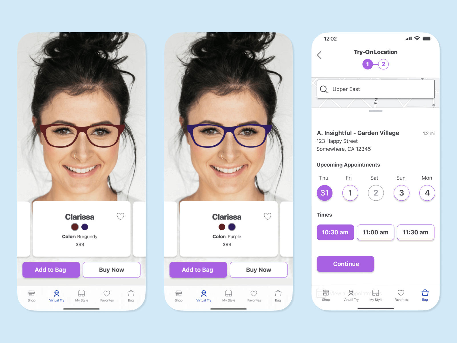
Designed Insightful, an eyeglasses shopping experience that features a style assistant and in-person appointment scheduling.

Empathize

Secondary Research

Although I have worked in the industry, I first wanted to conduct some secondary research so that I got a better overview of the problem space. I reviewed over 20 reports, ranging from academic papers to industry market research.

Key Points:

  • The global eyewear market is continuously growing so there are lots of individual businesses involved. Therefore, finding ways to improve user experience in this industry is even more important.
Statista fact: The global eyewear market grew from $140 billion to $197 billion from 2020 to 2027.Statista
  • Factors found important in eyeglasses store satisfaction:
Consumer Reports 65,000 user survey results: Cost, service and follow-up, convenience, and speed in product turnaround are important in eyeglasses store satisfaction.Consumer Reports

User Interviews

Insightful user interview statistics: 6 in-depth interviews, 200 user statements.

To better understand my eyeglasses shoppers, I conducted user interviews with individuals I selected through a screener survey. These users shopped for eyeglasses within the last year so that I could get a more reliable perspective on their experiences.

Affinity Map

With my user statements, I used an affinity map to sort and prioritize the data to help me gain insights from my interviews. These points were what I used in the further synthesis steps I completed.

Insightful affinity map for stress and guidance categories.Insightful affinity map for buying process and price categories.Insightful affinity map for frames i stock/saving time and not purely virtual experience categories.

Key User Insights

  • User wants to avoid frustration and embarrassment: The user doesn’t want to waste the assistant’s time. They want to make sure to be satisfied with the selection while still being efficient during the process.
Insightful quote about user wanting to avoid frustration and embarrassment.
  • User wants guidance: The shopping process is stressful as the user must find the balance between different influences: popular culture trends, personal identities, and perceptions of others. Users would appreciate early guidance so they aren’t looking at ones that won’t work.
Insightful quote about user wanting guidance.
  • User wants to be knowledgeable enough to feel in control: Since the shopping experience can be new and expensive for users, there is a want for transparency throughout the process.
Insightful quote about user wanting to be knowledgeable enough to feel in control.

Define

Persona

After synthesizing the data, I created a persona, Kathleen Davis to help showcase the insights from my findings. Kathleen wants to enjoy the eyeglasses shopping process, but is overwhelmed about the choices and trends.

Insightful persona Kathleen Davis.

How Might We Questions

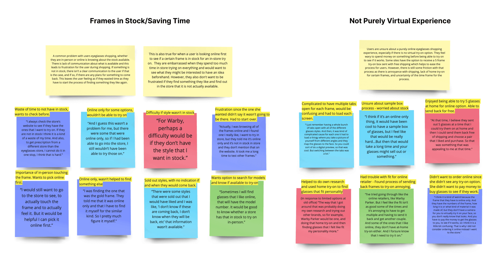
Synthesizing the data led me to three main insights that I was able to use to develop my questions I wanted to address during this project. These served as the baseline to develop my possible solutions.

  • Users are embarrassed when they spend too much time shopping for eyeglasses.
How might we help users efficiently choose eyeglasses that fit their style and needs?
  • Users find the selection process stressful as they must balance many different influences.
How might we assist users in feeling good and satisfied with their eyeglasses purchase?
  • Users feel as if they have no control when going over choices and prices that aren’t well explained.
How might we create a sense of confidence, control, and autonomy in the eyeglasses shopping process for users?

Ideate

User Stories

Now with a better understanding of my users, I next created user stories to get a more complete picture of the end goal product I wanted to create. This helped to keep the focus on the user while allowing me to get creative in ideating my design decisions.
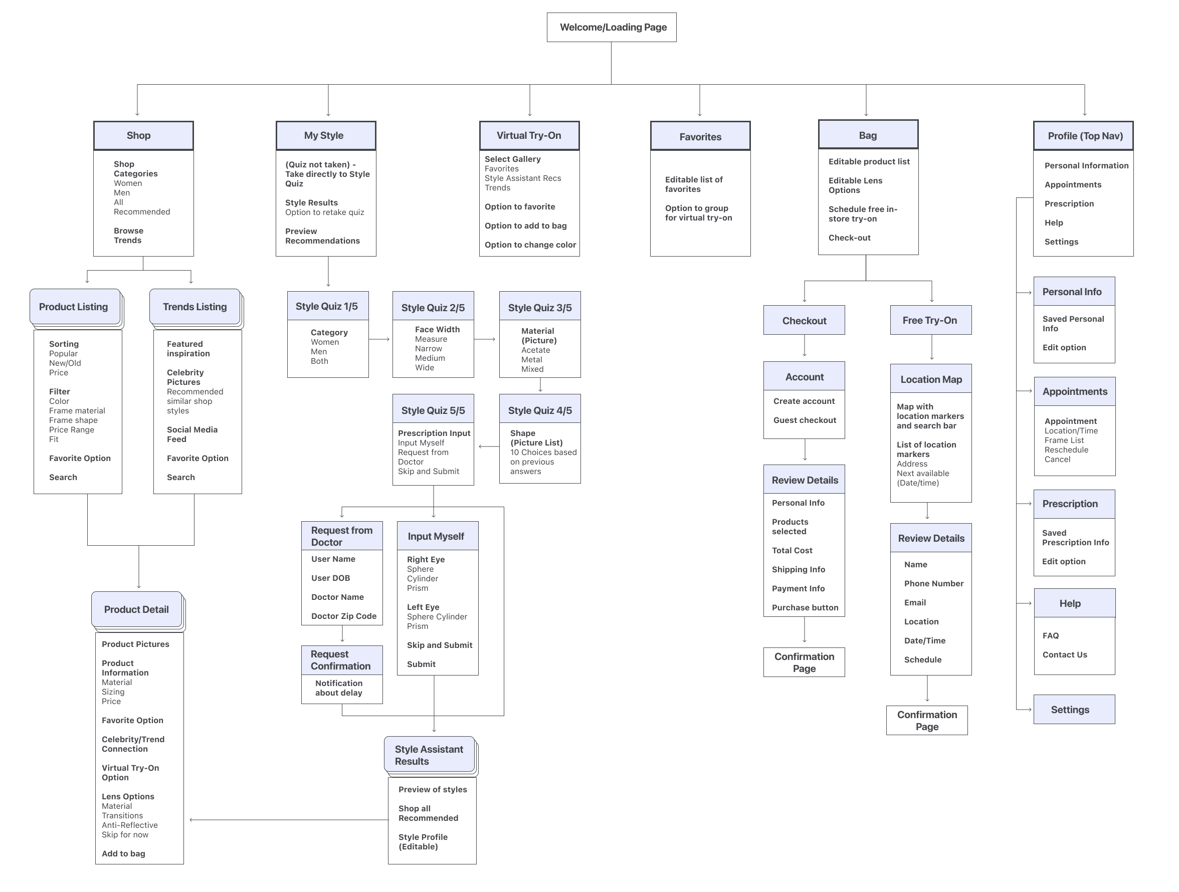
Insightful user stories talking about user looking at offerings and inputting preferences.Insightful user stories talking about user browsing recommendations and selecting frame choice.Insightful user stories talking about scheduling a free in-store try-on,

Site Map

Having analyzed what users need and what features I wanted to include in my product, I next created a site map to organize my screens and visualize how they are connected.
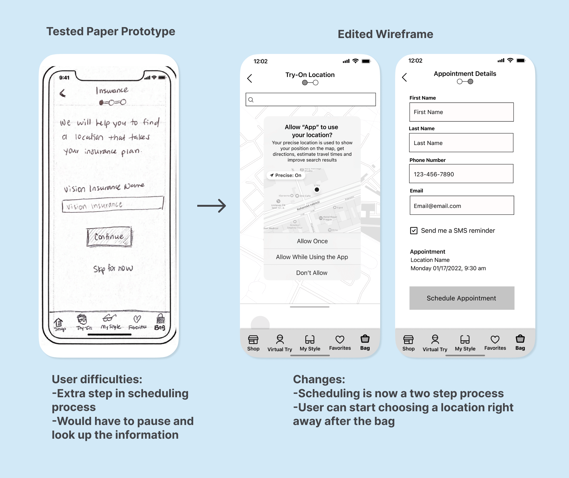
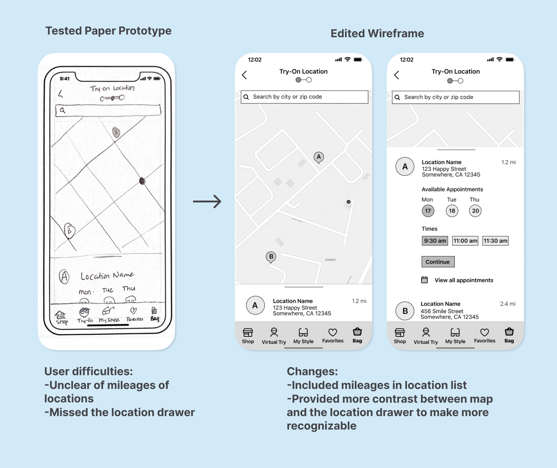
Insightful site map

Sketching the MVP

I next worked on creating paper sketches of the app. These sketches focused on two main features: the style assistant and the appointment scheduler.

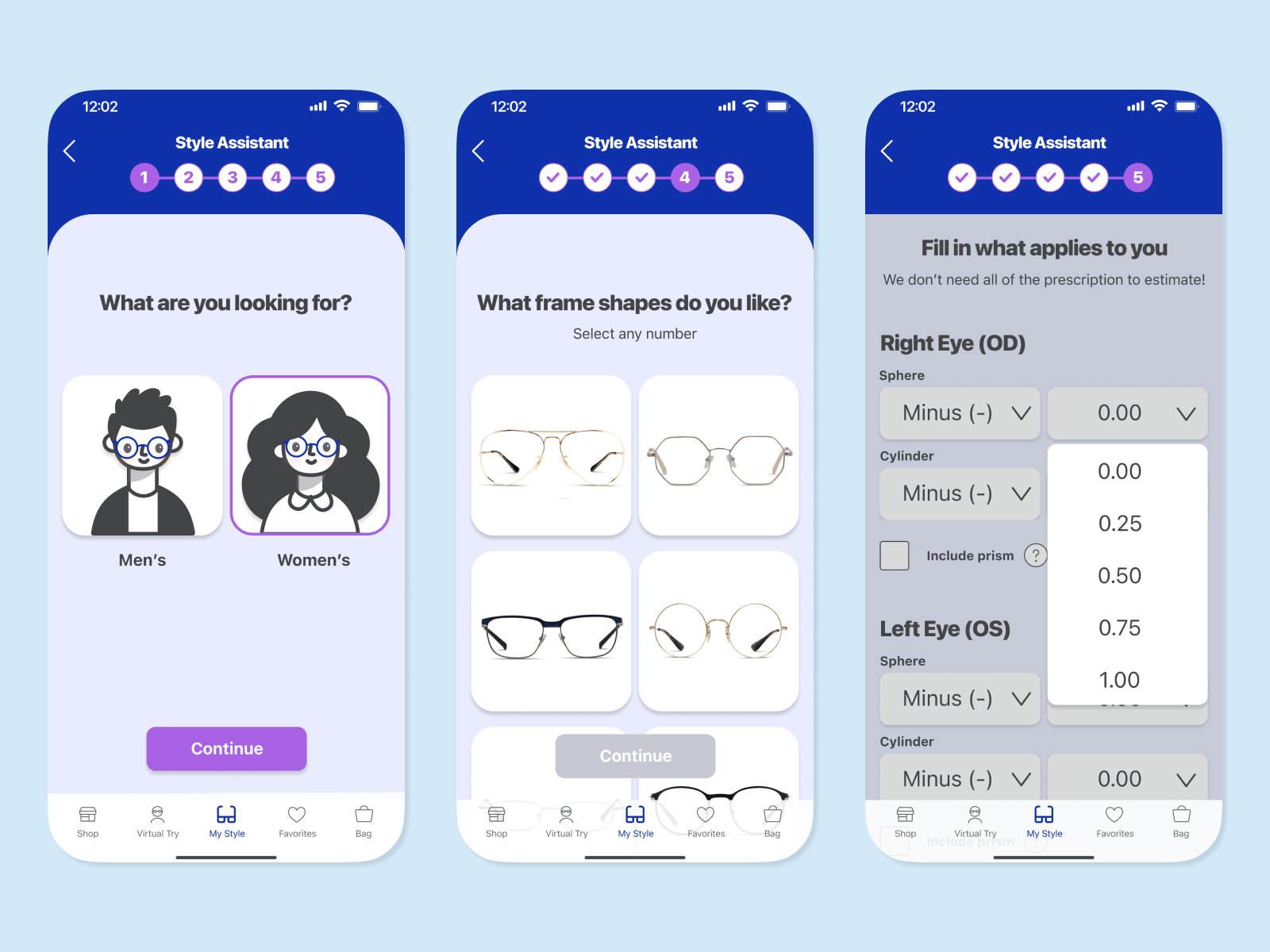
Style Assistant MVP: Focus on personalized recommendations and browsing

Several users stated they wanted more guidance as they were confused during the process. They wanted to keep up with the latest trends and suggestions, but didn’t know how to do so.

Insightful style assistant MVP sketches.

Style Assistant User Stories:

  • As an eyeglasses shopper, I want to look at offerings so I can decide if it is worth my time to look further into this company.
  • As an eyeglasses shopper, I want to input preferences so I can receive personalized frame recommendations.
  • As an eyeglasses shopper, I want to browse recommendations so I can choose favorites to think about purchasing.

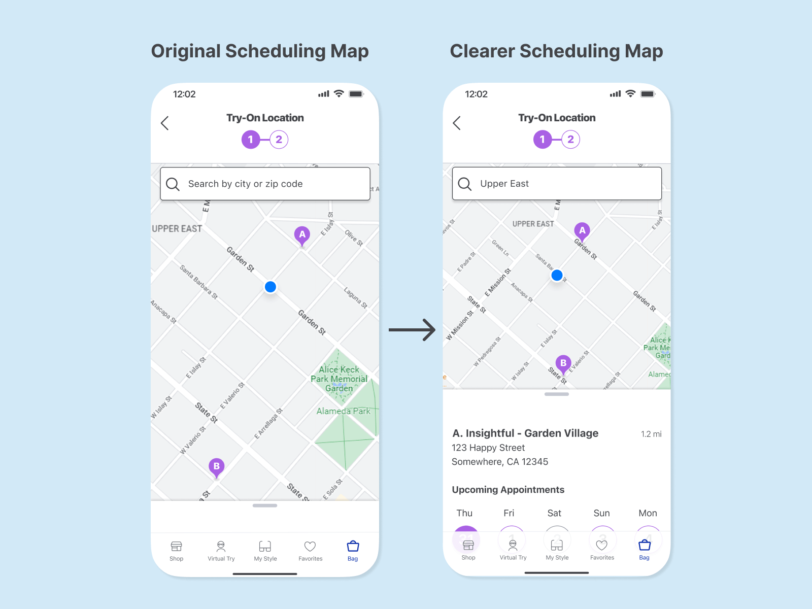
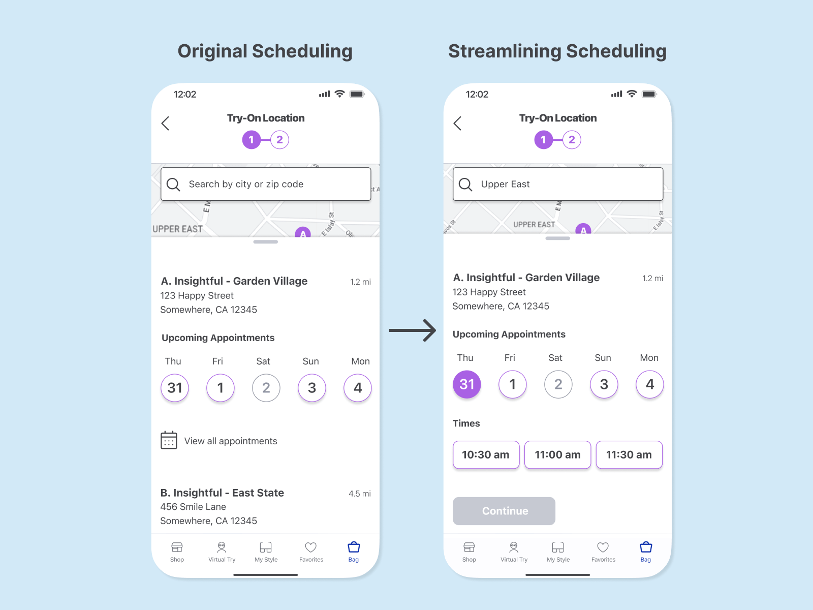
Scheduling MVP: Focus on selecting frames and scheduling appointment with minimum effort

Users want to try on their eyeglasses before making the purchase to check for things like fit, weight, and comfort. However, there was also hesitation, as users did not want to waste time, both their own and the store assistant’s by doing everything there.

Insightful scheduler MVP sketches.

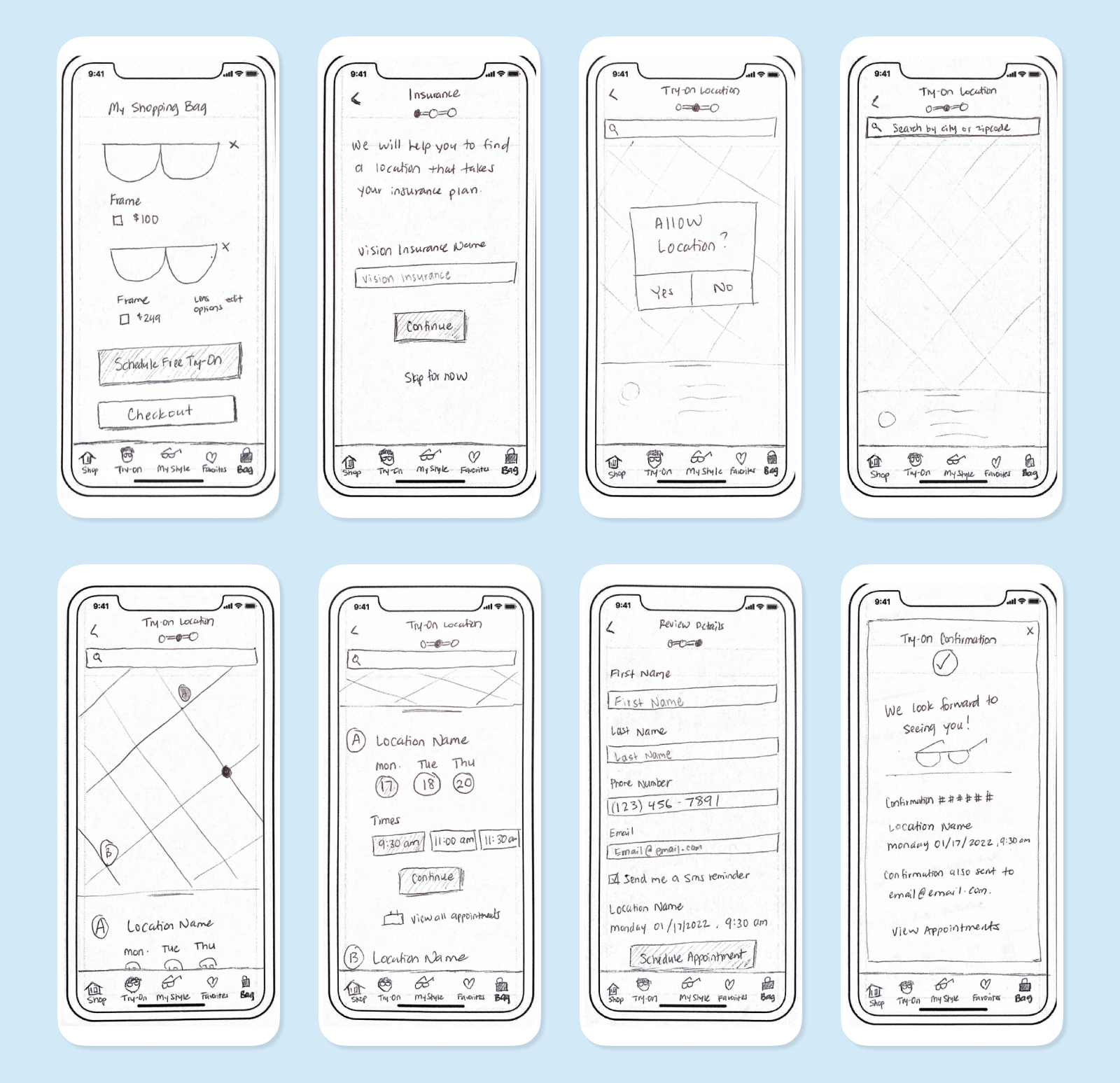
Scheduling User Stories:

  • As an eyeglasses shopper, I want to select a frame choice so I can limit my in-person shopping time.
  • As an eyeglasses shopper, I want to schedule a free in store try-on so I can feel the frame on my face to make my final decision.

Low Fidelity Prototype & Testing

Low-Fidelity Testing

Testing Statistics: 1 Round of Testing, 5 Test Sessions, 100% Task Completion.

After creating paper sketches, I used Marvel to make a paper prototype to conduct 5 remote guerilla tests to check for major usability issues.

Low Fidelity Testing Plan

Wireframes

After the testing, I found a few points where I wanted to make design changes as I began creating my wireframes. Even though users were able to complete the tasks, there were a few critical points to improve upon.

Changes Made:

  • Streamline Prescription Input - This section provides personalized frame results based on prescription limitations. In low-fidelity, it was a long section that brought confusion and errors. I consulted with an Optometrist and with his guidance, I streamlined the process in the wireframes so that it only asked for the minimum amount of information necessary to provide good recommendations.
Insightful tested paper prototype change to edited wireframe for streamline prescription input.
  • Lessen Scheduling Steps - Originally, the paper prototype had a step for the user to input their vision insurance to help choose a location. Some users noted they were surprised that it was at this point in the process and they would have to look it up. As this provided some slowdown during checkout, I decided to remove this step at this point, but plan to have it as an option elsewhere in the app.
Insightful tested paper prototype change to edited wireframe for lessening scheduling steps.
  • Scheduling Map Clarification - Users were confused about the scheduling map as some missed the location list drawer or the mileages of the locations. I made the wireframes have a scheduling drawer that is more detailed.
Insightful tested paper prototype change to edited wireframe for scheduling map clarification.

Adding Fidelity

Insightful high-fidelity mockup collection.

Insightful Branding

Insightful branding: Eye symbol and name.

Vision
Everyone should have easy access to getting the best look and vision. We strive to provide a simple and personalized eyeglasses shopping experience for people to see well, in the way that they want.

Insightful has an understanding and curious personality that works with current ideas and trends. We always want to work alongside others, helping them along in the process.

Style Guide

  • Color: Blue was chosen as the primary color as it usually evokes a feeling of loyalty and trust, things that the brand wants to embody. However, since Insightful also wants to be seen as personal and creative, there is the added color of purple to play with as well.
  • Font and Components: To keep Insightful simple and easily legible, the sans-serif font San Francisco was chosen. Also, the components and icons used have rounded edges to keep with a friendly and clean aesthetic.
Insightful style guide: color palette and components.Insightful style guide: typography and iconography.

High-Fidelity Prototype & Testing

Insightful high-fidelity testing statistics: 2 rounds of testing, 10 test sessions, 100% task completion.High-Fidelity Testing Plan

After creating my high-fidelity mockups, I used Figma to make a prototype to conduct usability testing. I conducted two rounds of testing, with a prototype iteration between the rounds based on what was observed in the first tests. Users were able to finish the tasks, but there were minor usability errors I wanted to improve upon and test again.

Changes Made:

  • More Instant Style Assistant Results Page - Users expressed an interest in having instant shopping results after finishing the style assistant. I adjusted the design to have the results teased directly on the page so they could start shopping immediately. When tested again, users no longer hesitated at the results and started browsing right away.
Insightful high-fidelity prototype change: more instant style assistant results page.
  • Clearer Scheduling Map - Some users were confused about the scheduling map as they didn’t realize when the map was showing the location search results. I adjusted the labeling in the search box to better indicate the location and included a larger peeking results drawer to make for easier access. During the second test, users had more ease in quickly finding their scheduling location.
Insightful high-fidelity prototype change: clearer scheduling map.
  • Streamlining Scheduling - Users were able to successfully schedule, but expressed that they wanted an easier way to compare times between locations. I took a look at saving a click for users by adjusting the design so the first available date is already selected and showing times. When tested again, users were confused at first since I used random dates and the user had no reference for "today". However, once I changed the dates to reflect the day of the test, users were able to schedule faster than the previous iteration. This fact showed me the importance of making the prototype as realistic as possible in all aspects.
Insightful high-fidelity prototype change: streamlining scheduling.

Solution

How Might We Answered

Now that I went through the design process, I wanted to reflect upon the questions that were posed at the beginning of this project. These were the baseline questions that I kept in mind throughout the whole design process. Now, I am able to pinpoint specific features in Insightful that help to answer these questions.

How might we help users efficiently choose eyeglasses that fit their style and needs?
Insightful how might we question answered: style assistant.
  • I recommend the use of the style assistant to help guide them through the shopping process.
How might we assist users in feeling good and satisfied with their eyeglasses purchase?
Insightful how might we question answered: virtual try-on and appointment scheduler.
  • Insightful offers users both a virtual try-on option in the app and a free in-store appointment scheduler to ensure different options before purchase.
How might we create a sense of confidence, control, and autonomy in the eyeglasses shopping process for users?
Insightful how might we question answered: shop, product detail, and my bag.
  • Insightful is an app that can be used on the user’s own time and comfort. There is also no purchase necessary for the try-on so that they maintain their own control.

Next Steps

Future Recommendations

I am excited that I have developed Insightful into a product that is able to address the needs of my users. However, I know that my work is never done as there is always room for improvements and suggestions for the future. I have currently identified two possible points of focus for future improvements:

  • Measuring Success - If this design was implemented, I believe it would be important to monitor and analyze users' interactions especially with the style assistant. Since it is a unique feature of Insightful, I would look to see if users are completing the style assistant and if not, where in the process do they leave. If there is a certain problem point, this may require more usability or A/B testing with a different design to see what improvements can be made. I feel that looking at these analytics would make the feature even better tailored and useful for the users.
  • Clearer Prescription Input - The prescription input process was the section of the app that required the most iterations and testing to streamline. I may have come up with a current solution, but I believe that there could still be more research into other possibilities. If there is a way that could better limit the human error of input, this section could be even more streamlined.

Final Thoughts

Since this was my first major UI/UX project, I found that going through the entire design process was valuable in understanding and applying the concepts that I have been learning to see them in action. I had chosen a topic that I had prior experience in, but it was fascinating to be able to take a step back from what I thought I knew and really let the users let me know what they need and use their insights to further improve my designs.